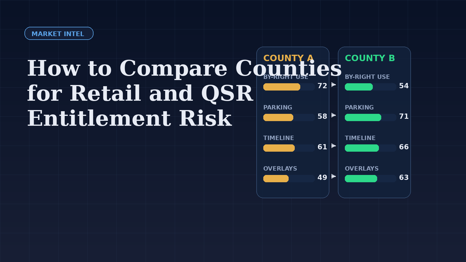
Retail and QSR teams often compare counties using demand variables first: growth, traffic, rooftops, incomes, or competitive whitespace. Those inputs matter. But if entitlement friction differs meaningfully between two counties, the “better” market on paper may be the worse market in practice.
This is why county comparison should include a zoning and approval lens from the beginning.
The wrong way to compare markets
A weak comparison framework focuses only on market demand and asking rents. That can push teams into counties where the use is technically possible but repeatedly slowed by discretionary review, corridor overlays, parking constraints, or fragmented municipal control.
In other words, the demand story may be strong while the entitlement path is structurally weak.
The better framework
When comparing counties for retail and QSR expansion, start with five operating questions:
- How often is the target use by-right in the commercial districts that matter?
- How strict are the recurring dimensional controls?
- How heavy are parking, stacking, and access standards?
- How often do overlays or municipal sub-jurisdictions complicate the path?
- How predictable is the approval timeline when the use is not by-right?
Why county-level thinking still needs jurisdiction awareness
Many teams say they are entering a county when what they actually enter is a set of municipalities, overlays, and planning cultures. A county may look broad and attractive, but the practical path depends on the local jurisdictions where target sites actually exist.
That is why county-level comparison should be paired with jurisdiction-level checks where possible. A county can be attractive overall while one city inside it absorbs most of the site inventory and most of the approval friction.
Metrics that deserve attention
The most useful comparison points are not always glamorous, but they are operationally meaningful:
- Typical commercial district families for the use
- Share of by-right versus conditional pathways
- Parking ratios for the target operator type
- Drive-thru stacking and access standards where relevant
- Setback and lot coverage patterns that affect prototype fit
- Evidence of overlay-heavy corridors
- Observed permit or hearing friction in the market
These metrics help teams choose between counties that may look similar on a demographic dashboard but are very different in execution risk.
How ByRightHQ supports comparison
ByRightHQ is useful here because it allows teams to compare more than labels. The value is not that one county has a GC district and another has a C-2 district. The value is seeing how the allowed uses, standards, and likely process differ once those districts are normalized into a consistent view.
That makes county comparison more operational. Instead of a vague sense that one market is “easier,” teams can inspect why.
A practical expansion workflow
For a retail or QSR expansion team, a pragmatic sequence often looks like this:
- Shortlist 3 to 5 counties using demand and strategic criteria.
- Identify the district families where target sites are likely to occur.
- Compare by-right frequency, parking burden, and drive-thru conditions.
- Flag municipalities or overlays that create extra approval friction.
- Rank counties not only by demand, but by time-to-viability.
The result is a smarter prioritization list. Teams stop treating entitlement as a late-stage surprise and start using it as a market selection variable.
Takeaway
The best expansion county is not always the one with the strongest top-line demand. It is often the one where the target use can move through the local zoning system with fewer hidden constraints. That is exactly the kind of difference a structured zoning comparison can reveal early.